Chrome新logo拿掉陰影效果主要是希望降低兩款顏色相接之處,可能會讓視覺產生顏色交錯的情況,避免使用者有不舒服的視覺感受。
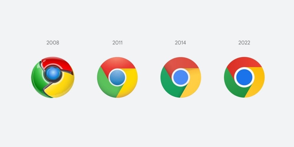
相較Mozila過去幾年內調整Firefox瀏覽器圖示的次數,Google從2008年推出Chrome瀏覽器之後,僅分別在2011年與2014年各調整過一次,而稍早則是由Chrome團隊設計師Elvin Hu公布接下來即將更換的全新圖示設計。
乍看之下,新款圖示幾乎與2014年更新版本沒有差異,但主要將原本紅、黃、綠之間相接的陰影效果拿掉,讓圖示變得更加平面化,另外也將顏色比例重新做了調整,讓整體亮度看起來更明顯。
依照Elvin Hu說明,此次拿掉陰影效果主要是希望降低兩款顏色相接之處,可能會讓視覺產生顏色交錯的情況,避免使用者有不舒服的視覺感受。
 ▲(圖/擷自 Elvin Hu個人Twitter頁面)
  ▲(圖/擷自 Elvin Hu個人Twitter頁面)
至於在整體設計部分,Chrome圖示基本上幾乎從2014年之後,便始終維持相同設計,不像其他瀏覽器在圖示調整有相當明顯改變。
而在不同作業系統環境中,Google也計畫各別作調整,例如在Chrome OS環境版本會採用無顏色漸層,同時顏色會更明亮,在Windows作業系統版本則會採用更明顯的顏色漸層感,在macOS作業系統環境會採用較強調立體感設計,藉此對應不同風格。
依照Elvin Hu說明,此次圖示更新將會在接下來幾個月內釋出。
Some of you might have noticed a new icon in Chrome』s Canary update today. Yes! we』re refreshing Chrome』s brand icons for the first time in 8 years. The new icons will start to appear across your devices soon. pic.twitter.com/aaaRRzFLI1
— Elvin ? (@elvin_not_11) February 4, 2022
We simplified the main brand icon by removing the shadows, refining the proportions and brightening the colors, to align with Google』s more modern brand expression. pic.twitter.com/Hyig51gqJq
— Elvin ? (@elvin_not_11) February 4, 2022
Fun fact: we also found that placing certain shades of green and red next to each other created an unpleasant color vibration, so we introduced a very subtle gradient to the main icon to mitigate that, making the icon more accessible. pic.twitter.com/H26wQKRhp9
— Elvin ? (@elvin_not_11) February 4, 2022
Then, we created OS-specific customizations. We want the icons to feel recognizably Chrome, but also well crafted for each OS. For example, on Windows, the icons take on an obviously gradated look, appearing at home on Windows 10 & 11. pic.twitter.com/q598abI3Rx
— Elvin ? (@elvin_not_11) February 4, 2022


26 則回應
有無想過用戶的感受=.=
.
.
.
.
.
我是說光圈葉片,想到那去
22年版是初版